Designing High-Converting Webinar Landing Pages: Your Step-by-Step Guide
Webinars have become an essential tool for businesses to connect with their audience, showcase their expertise, and generate leads. However, hosting a successful webinar starts with creating a high-converting landing page that compels visitors to sign up and attend your online event. In this step-by-step guide, we will walk you through the key elements of designing webinar landing pages that drive conversions.
1. Clear and Compelling Headline
Your headline is the first thing visitors will see on your landing page, so make sure it clearly conveys the value of your webinar. Keep it concise, engaging, and focused on the benefit participants will gain by attending.
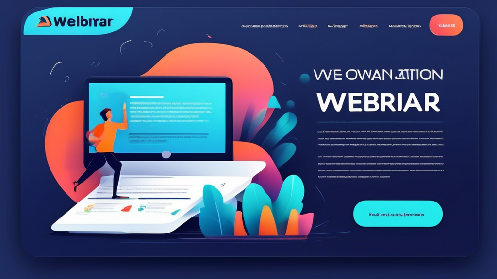
2. Engaging Visuals
Visual elements such as high-quality images, videos, and graphics can capture visitors’ attention and make your landing page more appealing. Use visuals that are relevant to the topic of your webinar and help convey the key information effectively.
3. Informative and Persuasive Copy
Your copy should highlight the key takeaways of the webinar, establish your credibility as a host, and create a sense of urgency to encourage sign-ups. Use a clear and persuasive language that resonates with your target audience.
4. Registration Form
Keep your registration form simple and easy to fill out. Ask for only the essential information you need to follow up with attendees effectively. Consider using a progress bar to show how far along visitors are in the registration process.
5. Social Proof and Testimonials
Incorporating social proof, such as testimonials from past webinar participants or industry influencers, can help build trust and credibility. Highlighting positive feedback can reassure visitors that your webinar is worth their time.
6. Call-to-Action (CTA)
Your CTA should be prominent, action-oriented, and clearly visible on the page. Use compelling text that prompts visitors to take the desired action, such as Register Now, Save My Spot, or Join the Webinar.
7. Mobile Optimization
With an increasing number of users accessing the internet on mobile devices, it’s crucial to ensure that your webinar landing page is fully responsive and optimized for mobile. Test your page on various devices to guarantee a seamless experience for all users.
By following these steps and optimizing your webinar landing page for conversions, you can attract more attendees, increase engagement, and ultimately achieve your webinar goals. Remember to track and analyze the performance of your landing page to make informed adjustments and improvements for future webinars.